Week 12 - Color and Whitespace
This week we continued to analyze color, but now began to incorporate the concept of space and how color affects this aspect of design. White space is an an important part of an instructional image because it helps the learner better understand and process the presented information.

Justification:
For this activity the students are 6th grade art students. This graphic introduce students to the process of creating box letters which will be an aspect of completing their final project. This graphic will serve will serve as an illustration for step-by-step instructions for boxed letters. The students have high and low reading levels and are familiar with the format.
I believe this solution will work because according to page 274 in our text, I used space as a tool for clarifying text. I created separate boxes for each of the four instructions to enable readers to see the structure of the document and access the more relevant pieces of information. According to the principle of creating contrast on page 268, I used different colored lines to signify the steps in the process for creating boxed letters. I used the concept of space and balance from page 275 to arrange the elements vertically and create balance between each of the steps.
For my user test, I showed this image to a teacher in my building. The feedback she shared with me was positive. She mentioned liking the use of bold text to label each of the steps. The only suggestion she had for me was to create more variations of my graphic to illustrate how these steps would work with other letters. I think she made a good point and am working on other letters that are not capitals or have roundness to their shape.
Week 11 - Organization
This week we focused on Organization and its role as a design element in an instructional message. Organization includes the chunking strategy and how it can be used to help lead the learner through a lesson. Organization is an important tool when designing an instructional image because it directs the learner to view specific points of your graphic. I have created the following image according to these concepts.

Justification:
For this activity the students are 6th grade art students. This graphic will expand on what students already know about the concept of tertiary colors. Students will have knowledge from preceding lessons on the terminology and the color mixing process. This project will serve as an illustration for how to name and locate the tertiary colors on a color wheel.
I think this solution will work because I used lines around each of the tertiary colors to create hierarchy and show importance of these colors according to the techniques listed on page 146. Another organizational technique I used was chunking. I created chunks in my information to make it easier to read and retrieve information by changing the direction and size of the text in the color wheel. According the page 139 of the text, I used larger font for the tertiary colors and aligned it the the shape because that is where I wanted the most emphasis. For the primary and secondary colors I used a smaller text and left the alignment horizontal for all pieces. This strategy still provides my reader with key information, however; it chunks the important elements.
For my user test, I showed my image to a 3rd grade teacher at my school. He provided me with positive feedback for the image I used but commented on the text. He said it was difficult to read the text next to my color wheel because of the font. I noticed this problem too. I played around for a bit with a few different text styles and settled on the orange one because it was still bold and contrasting, but was easier to read. I have included below the image with the first text I used for you to see the changes.

Week 10 - Color and Depth Project
This week I have analyzed color and the many ways it can be used to help create instructional messages. Through the readings I learned when to use color and also when color can become a distraction to the learner. For this project I incorporated the concepts about color and depth into my design for understanding Tint, Tone, and Shade.

Justification:
For
this activity the students are 6th grade art students. This graphic
will introduce students to the concept of color value.
Students will have knowledge from preceding lessons on the terminology
and the color mixing process. This project will serve as an illustration for how to create color values for tint, tone, and shade.
I created this image using color because I see it as necessary to aid students in showing associations, interpret related data, and emphasize the meaning of the information. According to our text on page 267, color selection make important information stand out. Out of all of the colors, I chose to use red as my pure hue because it is a warm color which tends to advance and it is the the first color in the color spectrum. I colored each of the circles to convey meaning from what the mixing process would look like. I used the principle of contrast for backgrounds and foregounds as discussed in the page 2 color insert in creating the images and balance with the text. I organized my information both vertically and horizontally so the information aligned for the learner to conceptualize.
For my user test, I had a 4th grade teacher view my image and give me feedback for areas of improvement. At first, I had titled the image with the words: Tint, Tone, & Shade, as a person who is not familiar with color theory Ashley didn't know what this title was supposed to mean. I had to explain to her that this was a lesson in color value and that the hue could be any color not just red. After having this discussion, I decided to title my image Color Value because that is the overall emphasis for my content. With the use of less text in my title I also decided to create a drop shadow for my text to create depth and convey meaning for the concept of value.
One other element I played with was the text color for the 'Pure Hue' and 'Tint', 'Tone', and 'Shade' circles. I tried the image with all of these words in a black text and also in a white text. I showed the differences to Ashley to compare the two. We both agreed that the white text created a better contrast to the fill color of the circle and was less of a distraction for the reader.
Week 9 - Selection Project
In this weeks module we learned about the Selection principle. To apply this concept I created an instructional graphic that helps the learner focus on my message through the figure-ground concept. Figure is considered the element of the message that the learner focuses on while ground is the area the the learner does not focus on. Each of these elements have been taken into consideration when designing this instructional message.

Justification:
For
this activity the students are 6th grade art students. This graphic will introduce students to the concept of complementary color schemes. Students will have knowledge from preceding lessons on the terminology and how to read a color wheel. This lesson will serve as an
introduction for the activities students will be doing when they create their own color wheel.
I think my image will be successful because I have created a good balance of the figure-ground relationship. According to the section on Actions and Tools on page 111 I have used contrast as a way to make important information stand out. I have drawn a bold outline around the complementary color combination on each of my color wheels. This helps focuses your eye on the important information using a visual magnification strategy. The outline creates contrast and improve the figure-ground distinction from the rest of the colors on the wheel.
The next element I utilized was Adding Elements to a Diagram from page 115. By placing a double sided arrow pointing to each of my complimentary colors I created emphasis on the principle of complimentary colors being opposite of one another on the color wheel. These arrows help students understand that opposite colors are not just vertical or horizontal but can be across the color wheel in other ways too.
For my user test, I showed this image to my husband and we discussed ways to improve my overall message. One of the things we talked about was my use of the boxes to contain the color wheels and the labels of the complimentary colors. At first I didn't have and shape around the color wheels and it was a little confusing to read all three color wheels as one section of information. I used an irregular shape to contain each of the color wheels instead of a rectangle or square. At first I had the shape large enough to fit the text too. My husband suggested I make it smaller and create a separate text box, so those are the changes I made. I am still playing with the idea of how to contain the information so that it is easy to read and understand.
Week 8 - CARP Project
Contrast, alignment, repetition, and proximity (CARP), the four Actions of PAT framework, constitute this week's theme. These are all element one considers when designing effective learning materials. For this weeks assignment I created a handout of step by step instructions for creating a "Name Color Wheel" project.
.jpg "How to Create a Color Wheel Name Design")
Justification:
For
this activity the students are 6th grade art students. This will be the
an introduction to the final project for a unit on color theory which asks
students to demonstrate
their understanding of the primary, secondary, and intermediate colors.
Students will have knowledge from preceding lessons on the terminology
used and color mixing principles. Students will have access and familiarity using necessary tools to complete this project.
The integration of the CARP principles will make this design successful because it increases the effectiveness of my instructional design. On page 201, I used contrast with a clear and bold typeface. I used a shaded box to break the process into the preparation and painting portions of the project. For alignment I used vertical and horizontal rows to display images and text. For repetition on page 203, I used the same image of a rectangle and information display for every step in the process. I integrated the principle of proximity to chunk information into each step.
For my user test I showed this graphic to my former students who have completed this project before and asked them if they thought this was a good tool for students to understand the project steps. They looked at it and decided I should break the process up into the painting and drawing portions, typically these parts of the process happen on separate days so I agreed. Because of this I inserted the text box in the middle of the steps. The students said the text was easy to read and understand. I think I will make another graphic like this to explain the process of creating block and bubble letters.
Week 7 - Design Process Model
This week we looked at the ACE model as a design
process. ACE stands for analyze, create and
evaluate, while principles,
actions, and tools (PAT) are a subset of
the Create phase of the ACE model. For our assignment this week, we were to create a graphic that will help students synthesize the content of our final project. I created a graphic organizer to introduce my students to the process of color mixing.

Justification:
For this activity the students are 6th grade art students. This will be the an introduction to the 3rd lesson of a unit on color theory which asks students to demonstrate
their understanding of the primary, secondary, and intermediate colors.
Students will have knowledge from preceding lessons on the terminology
used and color mixing principles. This lesson will serve as an introduction for the activities students will be doing from week 6 when they will be using paint to mix the color wheel. Students will be able to understand basic math principles and recognize the use of addition when combining colors together.
I think this design model will be successful in breaking down the color mixing process for students because I started the design by using a completed version of the color wheel students will be asked to create from the week 6 assignment. From page 85-86 in the course text, I used the tools as the core elements of design. Students will recognize the use of shape and line to identify and to organize color into schemes. In this weeks design I have added the use of tools such as color and type to my design.
I used the ADDIE model from page 91 of our text to analyze my instruction and identify a problem and design a solution to help students make sense of the information. Often times students have trouble reading the color wheel because they do not understand the principles of the color schemes, primary, secondary, and tertiary. To a novice art student the color wheel can create confusion because it only works when you know how to read it. By breaking the words down into their number meanings it allows students to relate to the information in a new way which will apply to the additive color mixing processes.
For my user test I had my student teacher view the image and we discussed how the image could be improved. Her thoughts were that I should have included the number 3 on the tertiary colors in the same way I did for the primary (1) and secondary (2). I had also considered this option, so we tried it. With the number 3 added to the 6 tertiary triangles, the image became too busy and unorganized. The number 3 is an implied space and with understanding of the primary and secondary mixing the 3 was unnecessary. For this reason I decided not to include the number 3 in my graphic, however I did make sure to mention the tertiary colors in an example in the text at the bottom of the page to ensure understanding.
Week 6 - Shape Tools
This week we were asked to develop an instructional message that uses the concepts of this chapter and incorporates shape as its foundation. I used the program StarBoard Software to create a color wheel assignment for my students. As part of this lesson I will be using the StarBoard to provide a guided demonstration on color mixing processes to create secondary and tertiary colors using the primary colors. The students will be using watercolors to mix the 12 color wheel colors and Hue, tint, tone, and shade.

For this activity the students are 6th grade students. This will be the 3rd lesson of a unit on color theory which asks students to demonstrate their understanding of the primary, secondary, and intermediate colors. Students will have knowledge from preceding lessons on the terminology used and color mixing principles. Students will be able to acknowledge the shape variations used; circle, square, triangle, and diamonds. Students will have previous experience mixing and using watercolor paints.
Justification:
This color wheel is designed to help students recognize color schemes. According to page 250 in the course text I used simple shapes to improve instruction and show unity. I have used different shapes to represent primary colors (circles), secondary colors (squares), tertiary colors (triangles), and diamonds for value variations. I also used lines to make connections and create groupings (p.253-254). An example of this is the dashed lines connecting the secondary colors and the solid line to distinguish the primary color groupings. These lines also create triangles within my color wheel while reinforcing color schemes. The color schemes are placed within a color wheel to visually demonstrate to students the mixing process.
For my "user-test" I had Richard Webb, a third grade teacher look at my image and verbalize his thoughts. "Love how you used shape to help explain the color wheel. Especially like how you used circle for primary and the square for secondary and triangle for tertiary. I think by using the square for secondary and triangle for tertiary, it will not only give them a visual ue but will also act as a sort of mneumonic device aiding in retention. I think it will be an awesome tool to help them understand the 12 colors on the color wheel as well as hue, tint, tone, and shade. Being able to see you do it on the starboard will reinforce it for them. What a great lesson!"
It was not my intent to design square for secondary and triangle for tertiary colors as a mnemonic device for students but I really like the idea I received from Webb. I do not plan on making changes to my image design based on the feedback I received in the user test. I will however, teach students the mnemonic strategy to use as a tool for remembering.
Week 4 - Typography
This week we were asked to create 4 text-only characterizations for words that deal with our unit topic. My unit is on color theory and the 4 words I chose to use are: color wheel, cool colors, warm colors, and shade. I had several ideas for my how I was going to create my typography for this assignment but the problem I had was in the execution. I am not familiar enough with the program Firework know how to create the typography I had in mind. I spent most of the week searching for tutorials and applications that I could use. So, here is what I cam up with:

Justification:
Describe your users and the assumptions you made about them.My audience is 6th grade art students. My students are able to read the words I chose to characterize and are familiar with the terminology associated with my unit. My students are able to recognize familiar shapes in the text and make connections with the graphic representations. Since my unit is on color theory it was important for me to use color in each of my images to help emphasize the meaning of the word.
Describe why you think your solution will work; include at least two ideas from the book, including page numbers and your interpretation of the passage used.
On pages 213-214, the text discusses how typeface is powerful in expressing emotion or enhancing a message. The example of the text 'War Declared' and 'DELICATE FLOWERS' is what inspired me to use the flame text for the concept of warm colors. The meaning of the words is emphasized by the typeface used. For my word 'warm colors' the flame shaped letters remind students that warm colors are the colors that remind us of fire; red, yellow and orange.
I also used the examples on page 215 for my other words. Text can be aligned to the edges of lines shapes and pictures to emphasize a words meaning. I used this principle when creating both images for 'color wheel' and 'cool colors'. I used a program that allowed me to upload images and format my text into the shape of that image. For color wheel I used a picture of a wheel and colorful text to help express the words' meaning. For the word 'cool colors' I used only cool colored text and placed the words in the shape of a snowflake. From page 215 I also used the concept of contrast and depth to create my image for shade. I used the word shade with shadows and bold typeface to express the meaning that shade creates a shadow and darkening effect.
Describe what you learned from a 'user-test' (have someone look at the image an verbalize their thoughts while looking at the image). Describe the changes you will make based on user comments:
I showed my images to a 3rd and 1st grade teacher who work in my building, their comments were generally positive but they suggested a couple of things. The first image of the snowflake which I had showed them was a thinner design and they both said it was difficult for them to make out the shape of a snowflake through the text. To fix this, I first tried using an image of a snowman. I didn't like this result, so I found a better snowflake image and changed this in on my draft.
Another piece of feed back I received was for my 'warm colors' image. At first I had the text read 'red yellow orange' because those are the warm colors. The other teachers found this confusing because they were not sure if it would make sense to a student who was looking at the color names, so I changed the text to say warm colors. There was also a comment of why words for color wheel where random in color instead of being placed in the rainbow order. I considered this feedback and decided not to change that aspect of my image because it seemed too literal of an interpretation of the word. I am still going back and forth on this, what do you think?
Week 2 - Universal Design Image
I chose the image of hot and cold faucet handles to represent Universal Design. When teaching color theory to my students I usually give them the example of hot and cold faucet handles to help them remember warm and cool colors. I have the students consider what it would be like if they went into a bathroom as a kindergartener who couldn't read the words hot and cold. If the handles were colored blue and red, even a kindergartener would be able to tell you which handle would turn on the hot or the cold water. This is because we associate the color red with warm and the color blue with cool.
With this lesson, my 4th grade students usually begin a discussion about other ways people can tell which handle is which. Even if there are not any colors on the faucet, or if the person is blind, everyone would know that the hot water is always on the left and the cold water is on the right. They make an excellent point considering the concept of universal design.
Another aspect I have them consider is what it would be like if they went to a faucet in another country like Mexico or France. Would they have the same U.S. plumbing standards of hot water on the left and cold water on the right? If they didn't, the warm and cool colors would still help anyone associate the warm with red and blue with cool water.


Week 1 - Introductory Image
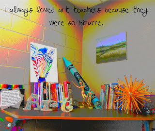
"I
always loved art teachers because they were so bizarre. They were like
the homeless people of the faculty -- all disheveled, wearing smocks,
covered in paint, always digging through the garbage, looking for
bottles and egg cartons and things."
- Ted Alexandro
No comments:
Post a Comment